The variety of covers that are available for this single novel is impressive, but begs the question of why? If each of these is the same text, why do they have a different cover illustration?
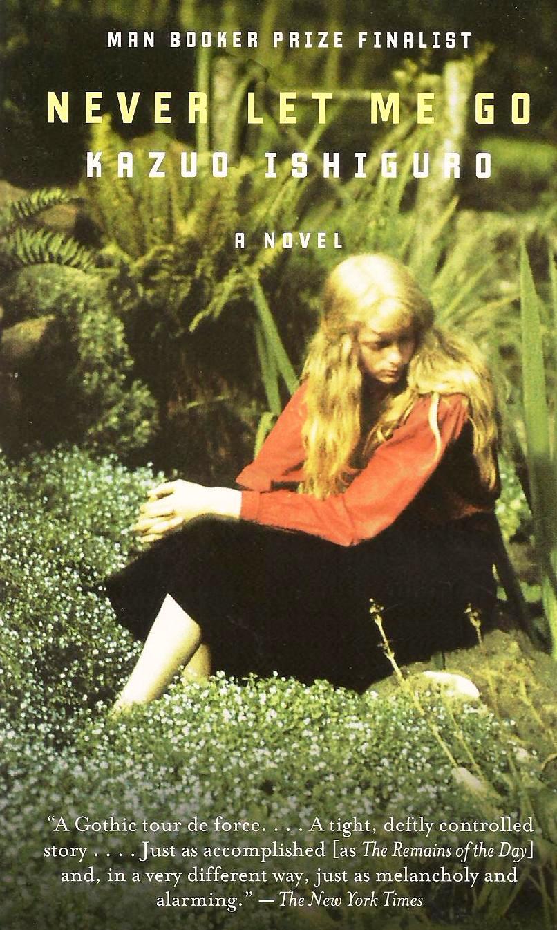
The four pictured here for Never Let Me Go all create a similar resulting overall mood but in different ways and with unique undertones and styles. The meadow at first appears light, lush, and natural, but the heavily saturated shadows paired with the expression of the girl makes it fantastical or uncanny. The girl's light, long hair and pale skin contrasts the figure in the next cover illustration, whom has dark, short hair and a seemingly darker complexion. This change could be based on the region in which the book was intended to be sold, or could be different artists takes on a character. The blurred shapes, generally warm colors, and serif font create a mix of comfort and instability. The last two images are cooler in color schemes and utilize more grey to black. The boat image is slightly asymmetrical with a slanted horizon which contrasts the simple, serif font that sits symmetrically on the cover. This combination of nature and the lonely man-made object creates an eerie mood playing on emptiness and adventure. The last picture plays on the darker elements of NLMG: the organ donations, the woods at Hailsham, and careful relationships. The precarious looking font and barbed wire human figure create a unique cover that uses fear to grab attention.


I am going to further examine the barbed wire image and meadow image.
When first looking at the meadow cover, I think of words like "warm," "fade," and "careful." The girl, though in the forefront of the image, feels small in her setting and reminds me of the story of Thumbelina - the image seems very delicate. The other cover draws up words like "monster," "anxiety," or "smoke." The image has a visual texture and is sort of uncomfortable for the viewer.
Without reading the novel, the first cover would make me think of a romance or fairy tale because of the image, but the chosen quote would make me think of the story as a possible tragedy. Now, having read the novel, this image reminds me of Kathy's descriptions of the fields at Hailsham, the yards at the Cottages, and the landscape she drives through as a carer. The second image, without context, would make me believe the story was dystopian and scary, or maybe just scary. As mentioned before, this cover draws on specific images from NLMG such as the organs and the woods. These are the things they are "told, but not told." The characters hold these things in their mind with grim but unwavering anticipation. The barbed wire reminds me of the final trip with Kathy, Tommy, and Ruth, to see the boat. It represents the fragile relationships they shared and how towards they end Kathy and Tommy felt a need to be careful around Ruth.
It seems that in the meadow setting Kathy is being portrayed, though there is not much distinctive description of her in the book itself. The emotion portrayed by her longing face and cautious position seems like the character of Kathy that we later get to know. Since the story is from her point of view, I would not know who's point of view this image would have been captured from; it most likely would have been Tommy, her close friend. The second cover represents a feeling that is held by all of the clones, a symbol of their future, from Kathy's viewpoint.
The first image fits the very Anglo-Saxon construction of the story with its setting and figure, with an interpretation favoring humanism and romance. The second image suggests the theme of humanity as well, but with dark tones and a more contemporary format.
The diverse range of covers created for a single novel is quite interesting. While the content is the same, the unique selection of images and placement of text has the power to draw a new eye, a new audience.
I really liked how well you were able to decipher and unCOVER (haha) what these covers are really getting at and why different covers appeal to different audiences. I particularly loved the connection that you drew between the barbed wire as a symbol for the fragile relationship that exists between Kathy, Tommy, and Ruth near the end of the story. My only constructive criticism would be that maybe you could have speculated into the potential cultural context of the darker cover, or who might have created a cover like that. Maybe by looking at the idea of this second, darker cover being about cloning, you could have concluded that this was from a scientific context or background. Just a thought :) But overall, wonderful job with this post!
ReplyDelete